SketchUp Material Editor – Enhanced Materials in SketchUp
I previously wrote a post on using Enscape with SketchUp which covered light sources. This post will cover the monumental improvements to materials in the current release of Enscape. It is truly amazing, the level of realism we can achieve with so little effort and with blazing fast speeds. What used to take hours to render and look decent in our old software, now takes seconds and looks remarkable using Enscape.
The first image is a reminder of where we left our sample SketchUp model in the previous post: BEST PRACTICES FOR LIGHTS AND MATERIALS IN SKETCHUP. In this post, we will look at how the new Enscape Materials tool will allow us to enhance a few of the materials in this scene.

Enscape render from previous blog post
Woodgrain and finish
Let’s start with the wood material at the transaction surface of the reception desk. Next images are designed to let you see details and how the lighting looks on surfaces.

Wood desk closeup in SketchUp
Similar to what we saw in the previous post, the following image shows how the wood material would look like in Enscape without special naming or new adjustment opportunities.

Wood desk closeup in Enscape
Again, heading to where we left off in the previous post, simply adding the word “granite” to the SketchUp material name causes Enscape to apply a pre-set reflection to the surface as shown in the next image.

Wood desk material name change
We’ll now cover what else can be accomplished with this material representation in Enscape. While the special names in a SketchUp material still work, we have several more options which can be adjusted in a number of ways.
The great thing about Enscape is its emphasis on simplicity. And to that end, anything we can set in the primary author tool, SketchUp in this case, such as selecting a texture, Enscape uses that information rather than creating duplicate functionality. Thus, the process of editing a SketchUp material starts with selecting the material in the Materials tray as shown in step #1 below. Next, if not already open, the Enscape Materials dialog is opened. This dialog is tied to the currently selected ’In Model’ material.
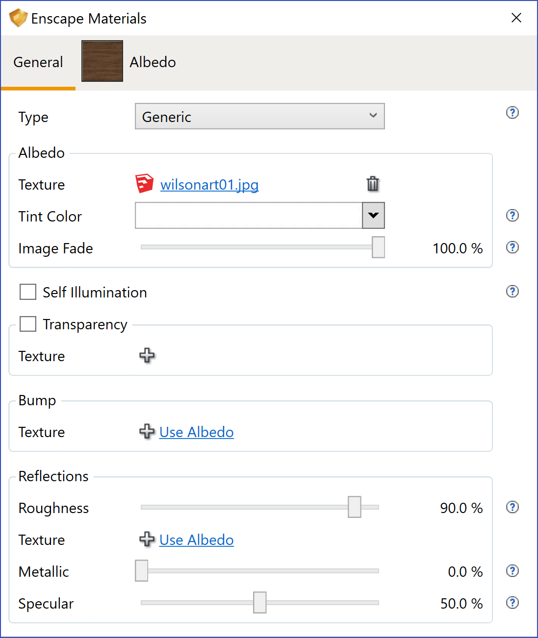
Enscape material edit based on selected SketchUp material
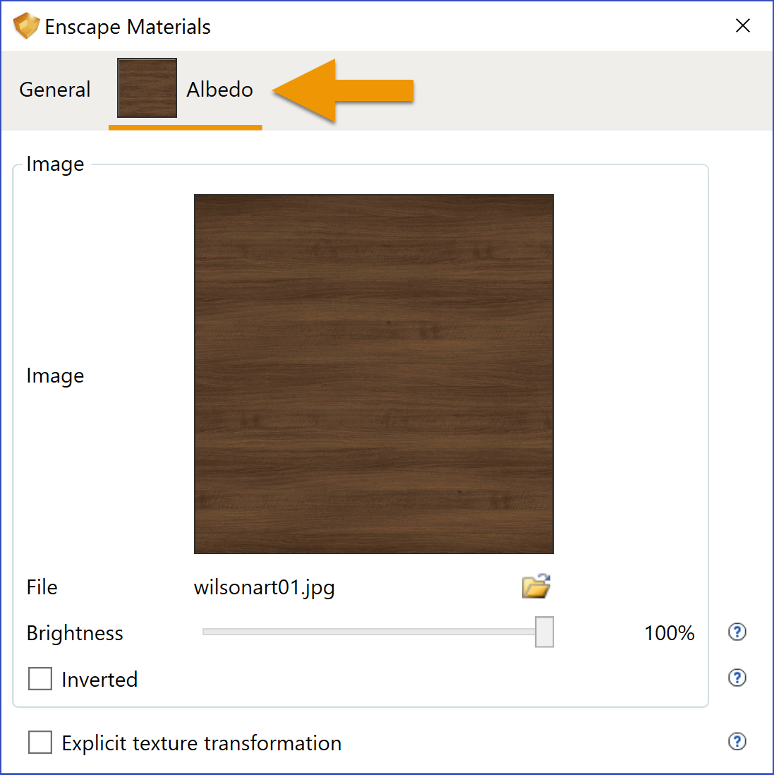
Albedo (texture) settings
In the left image, we see the texture (wilsonart01.jpg) and a minimal surface reflectance. Everything else represents new opportunities to enhance a material above SketchUp’s native capabilities. Note that these material ‘extras’ are saved within the SketchUp file by Enscape. Thus, anyone with Enscape installed and licensed, can work with these same settings. However, for bump and glossy, only the paths are saved in the SketchUp file, so you have to ensure that they are located at the correct position.
At one point, in addition to the General settings, there is an Albedo tab as pointed out below. This tab offers a few additional adjustments to the texture, such as Brightness, Inverted and Size.
Albedo (al·be·do): The portion of incident light that is reflected by a surface. It is a subset of what defines the material property. This, in and of itself, is an interesting topic we will discuss more in future posts.
If we would like to create a high-gloss finish we can adjust the Roughness slider to a lower value (item A). In a subsequent step, we will also add a bump map. This image points out the option to quickly use the original image by clicking the Use Albedo link (item B).
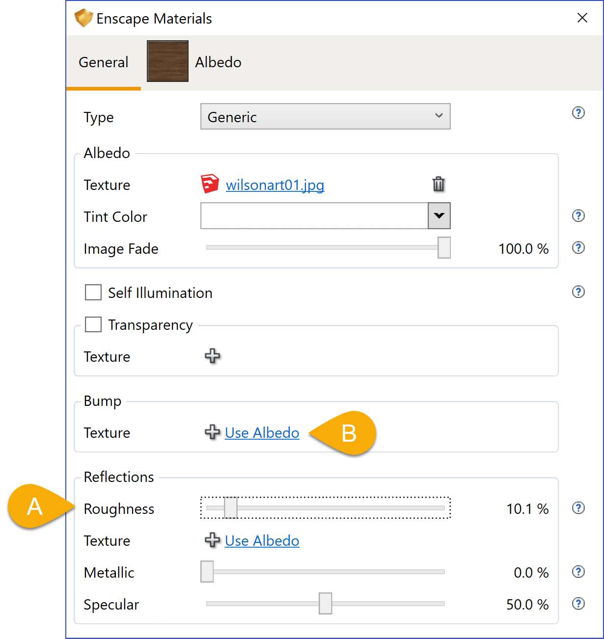
Adjusting Roughness value
Roughness: Defines the amount of microscopic surface structure that spreads the reflections.
After clicking the Use Albedo option, notice that texture is listed in the Bump section. There is also a Bump tab at the top of the dialog as shown in the next image. The Bump ‘Amount’ slider is used to determine how much the surface is deformed based on the selected texture.
Enscape makes the process very simple in that when you clicked ‘Use Albedo’ the same scale was applied and the texture is gray-scaled.
You can actually see (left picture) ridges in the wood grain and the light and shadow interacting with them. Beautiful. To continue our experimentation, let’s make a more drastic change to the bump ‘Amount’ value and set it to 3.03. As you can see (right picture), the result is very pronounced; both in the surface deformation and the lighting.
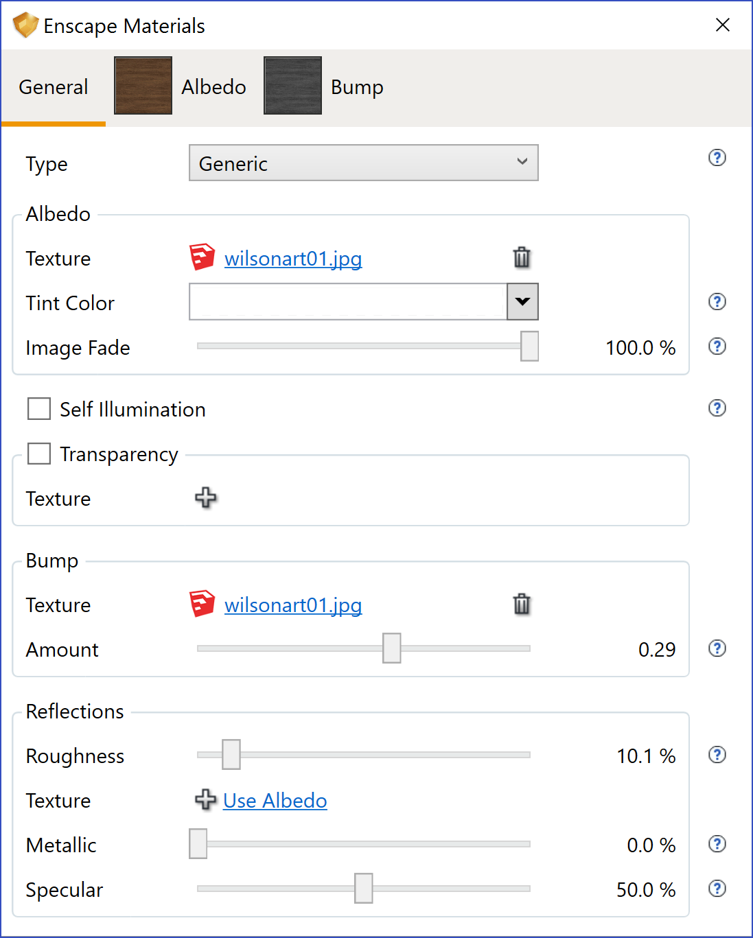
Bump texture applied based on albedo

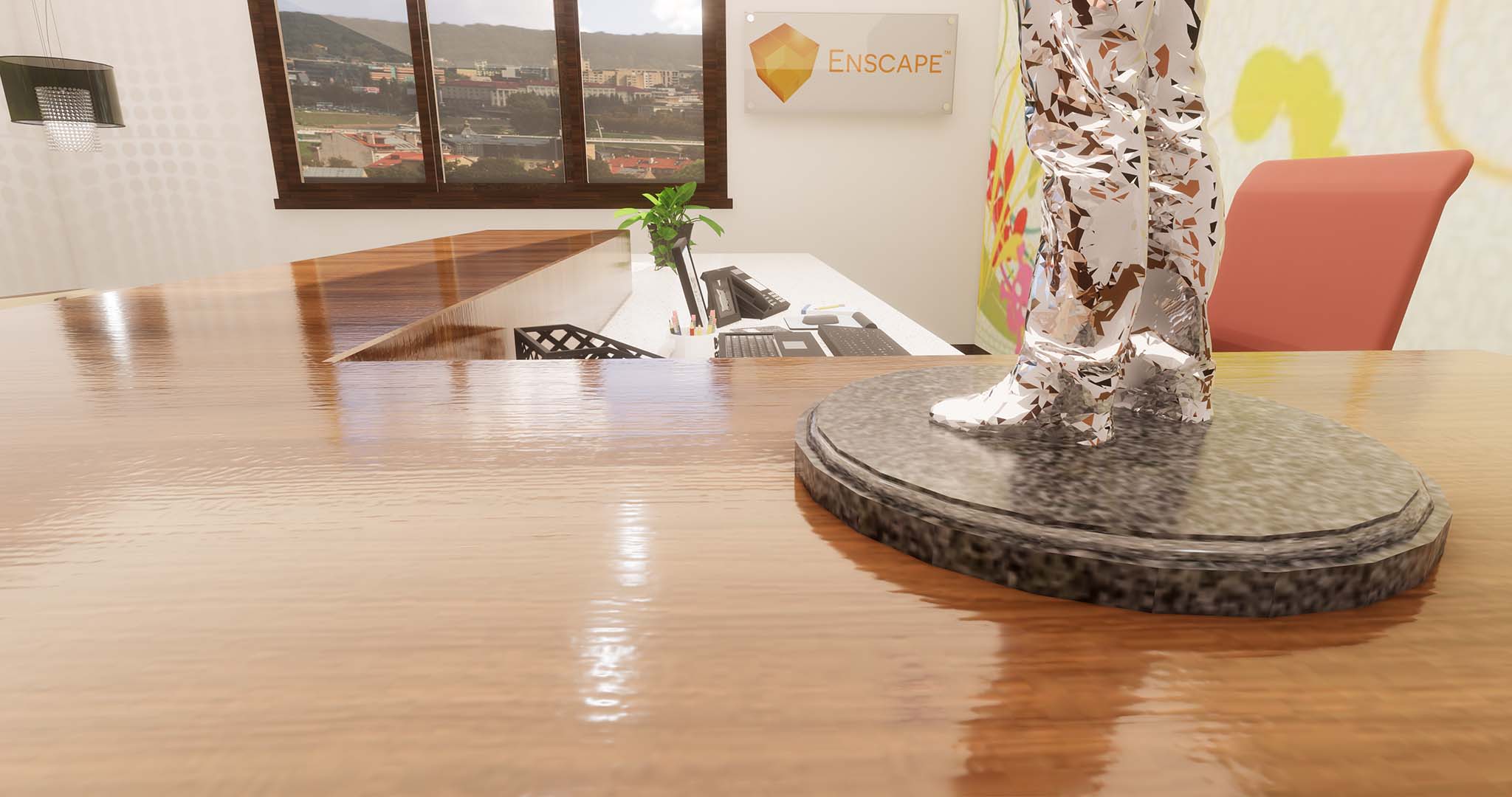
Bump texture applied based on albedo
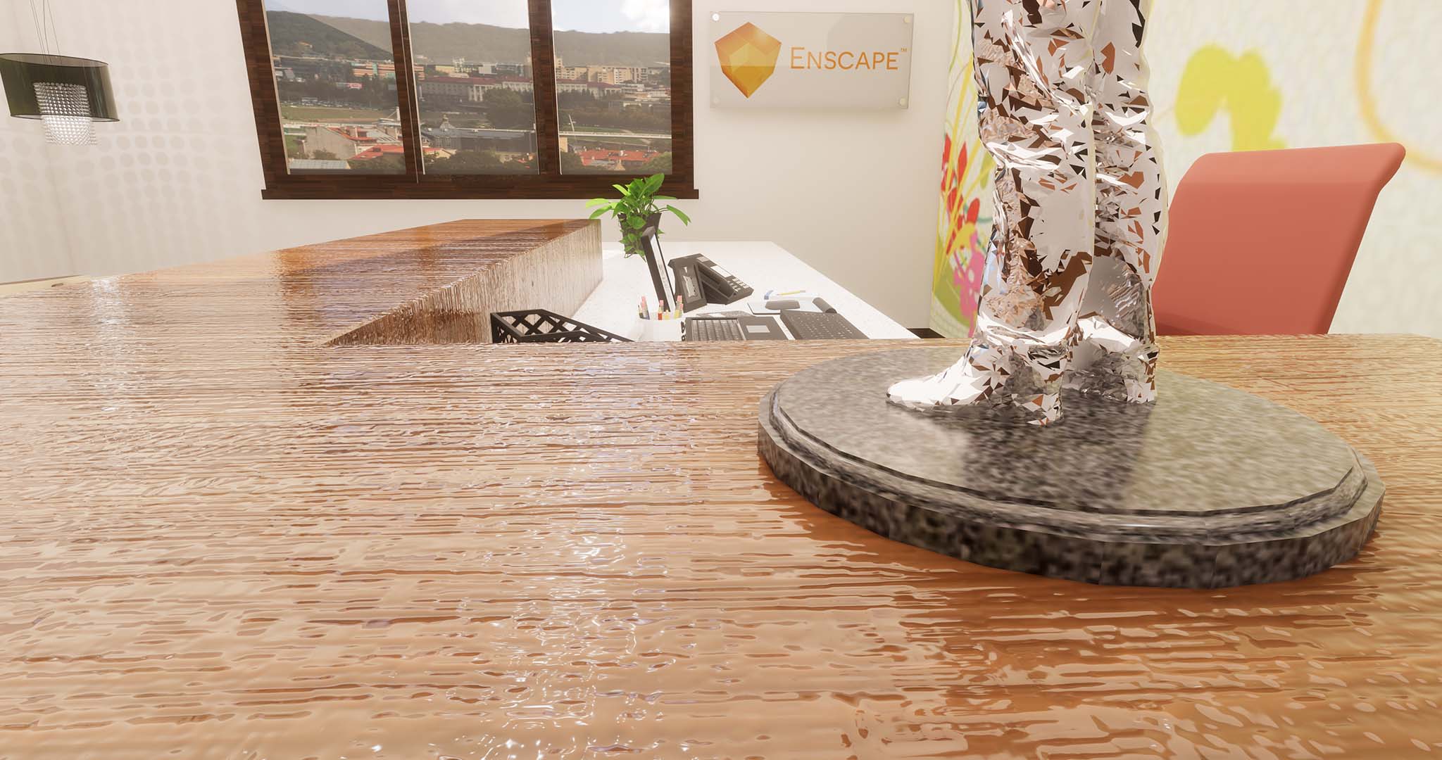
Wood desk results based on material edits
On the bump tab, we have a few settings available. One is the ability to invert the image. The area that projected out previously will now be recesses and vice versa. The right image contrasts the two settings which have been aligned along this diagonal line. In the case of woodgrain, this setting may not be useful, but this example helps describe the opportunity.
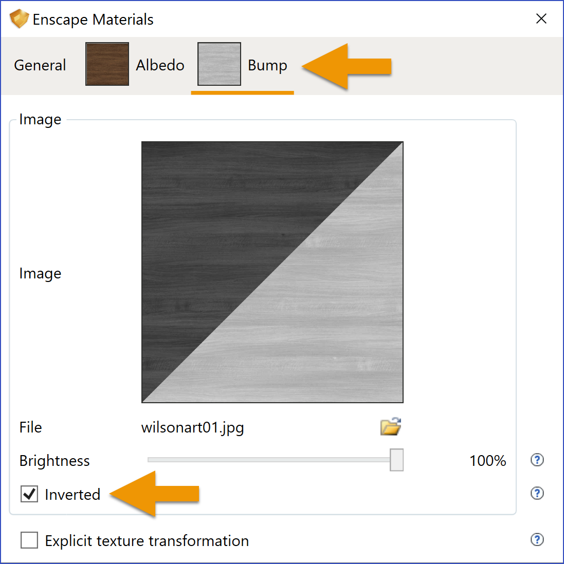
Inverting bump texture
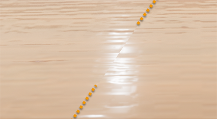
Compare inverted bump map
Setting the bump back to our previous value, let’s see what the Roughness value does; changing it from 10% to 30%. The result is as seen in the left image. This result is close to what a Wisonart laminate surface might look like. Roughness, as a percentage, can be thought of as the opposite of reflection as a percentage; a lower Roughness number is more reflective.
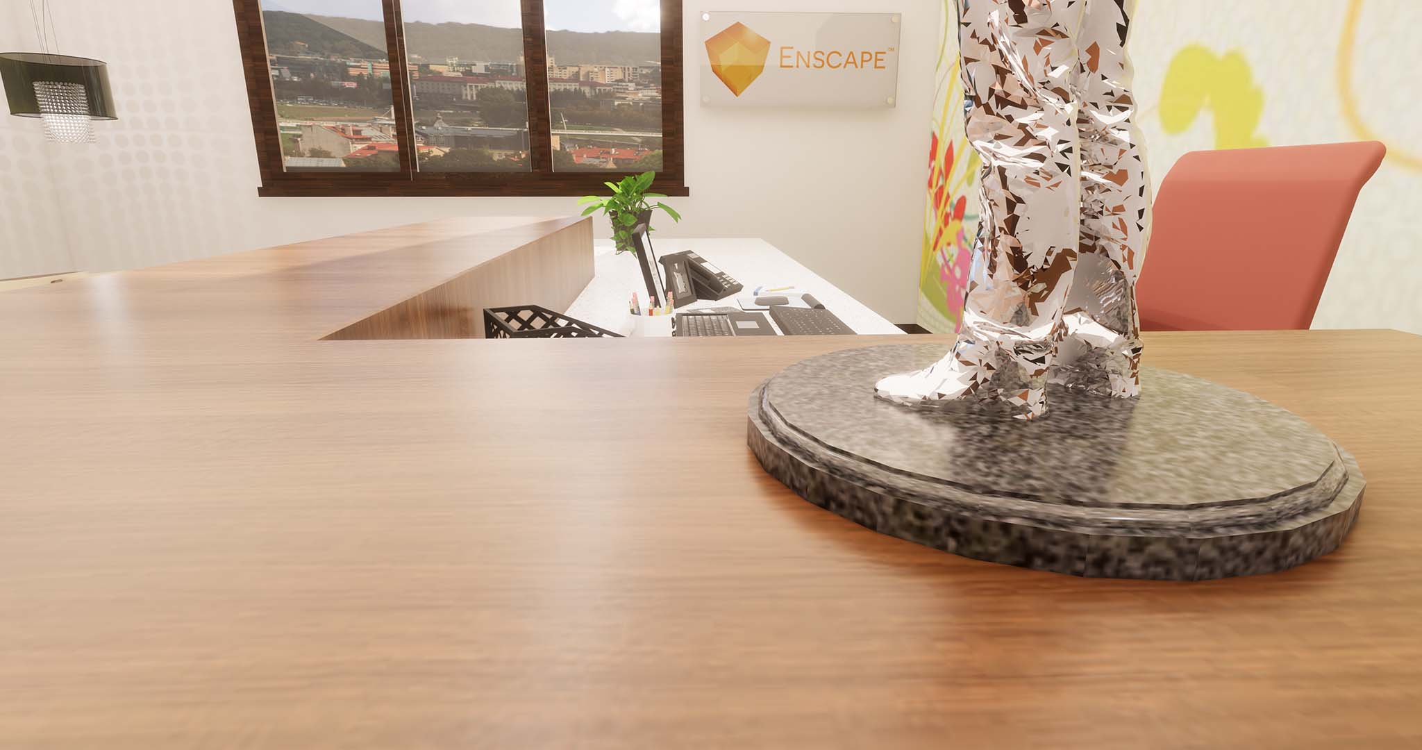
Result of adjusting Reflection’s ‘Roughness’ value
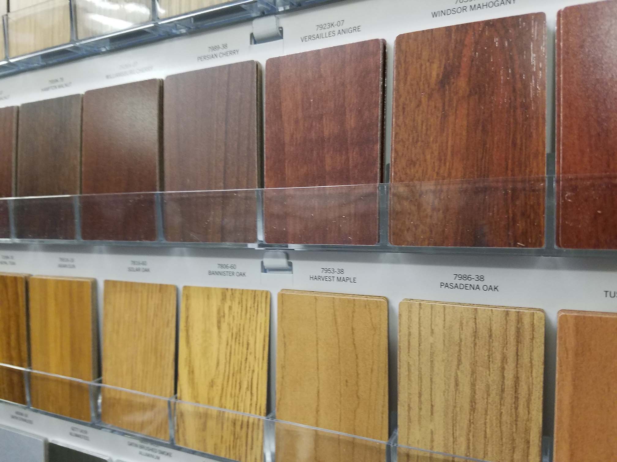
Laminate Samples Board
Like most architecture/interior design shops in the US, we have a large Wilsonart sample board in the office I work in. Notice the highlights from the light and the texture of the woodgrain in the image below and compare with the Enscape render above.
With the settings and results we just reviewed in mind, we have a good understanding of how easy it is to develop realistic looking wood material in our designs.
Exploring Fabrics
Let’s now shift our attention from wood to fabrics. The first thing we will do is look at the view I composed in Enscape to see what the material looks like before we change anything. The chrome legs and the brown plastic base look great with no changes. But, in this case, I already enhanced the wood flooring using the techniques we previously covered.

Fabrics viewed in Escape with no Enscape material edits
The technique for getting a realistic looking material is to apply an appropriate bump map. In this case, we do not have a Use Albedo option as the Albedo is simply a color. In this case, we choose an image file to, essentially, be overlaid on the colored surface – which is then used to deform it. We also adjust the bump ‘Amount’ to control the amount of deformation.
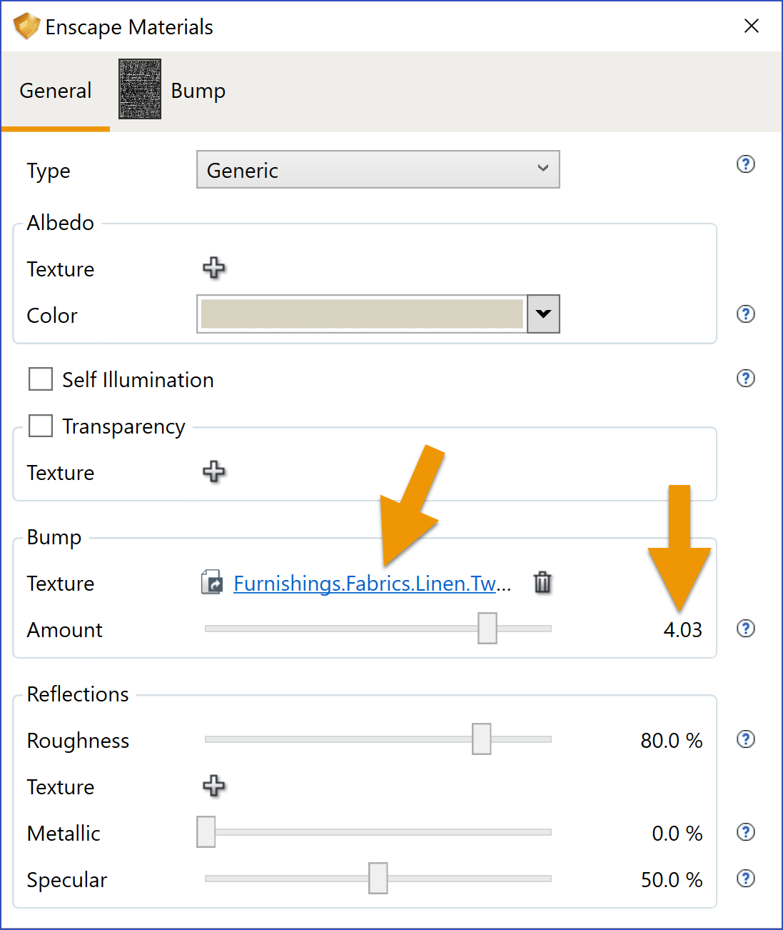
Adding unique ‘Texture’ and ‘Amount’ for bump
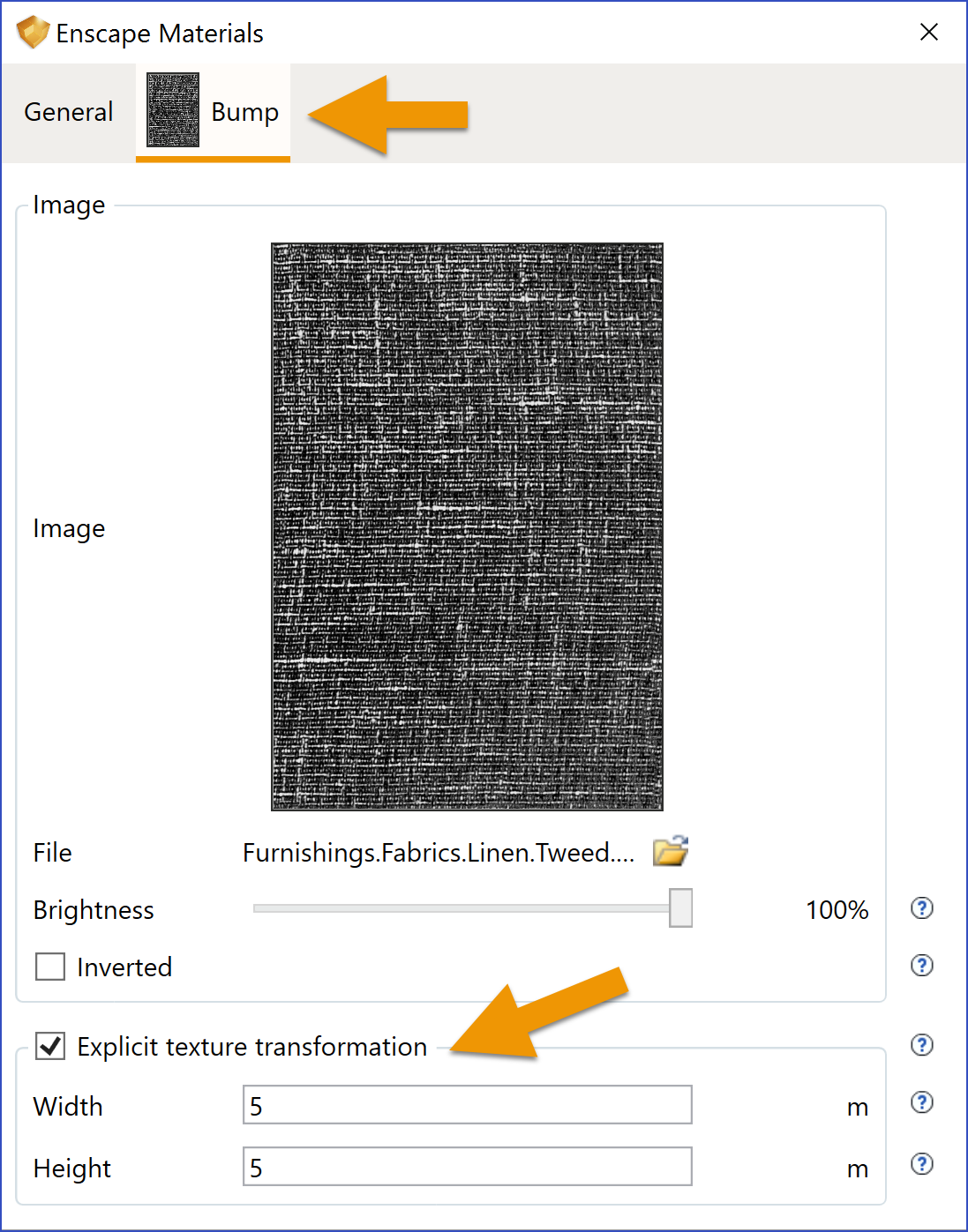
Setting unique bump texture dimensions
Once the texture has been selected, we have a Bump tab available. Here we can set the scale of the texture. This is an important setting to get right when trying to achieve a realistic effect. People will generally be able to tell when a material does not look proportionately correct.
There are many places to get texture image files on the internet. The textures I used happen to be from the Autodesk Revit texture folder, which anyone could access, even just by installing the trial version. If you use the Autodesk materials, you should know there are three folders, all with the same images, but at different resolutions. Be sure to use the high resolution ones in this folder: C:\Program Files (x86)\Common Files\Autodesk Shared\Materials\Textures\3\Mats.

Example of textures installed with Autodesk Revit

Search a texture library in Windows Explorer
Once the textile bump has been selected and adjusted, the results are astonishing in Enscape. Just amazing. I used a different bump texture for the ottoman and will show those settings in the next images.

Fabric results after Enscape material edits
The next two images show the settings for the ottoman fabric… I really love how the textures turned out in Enscape from just a few simple adjustments.
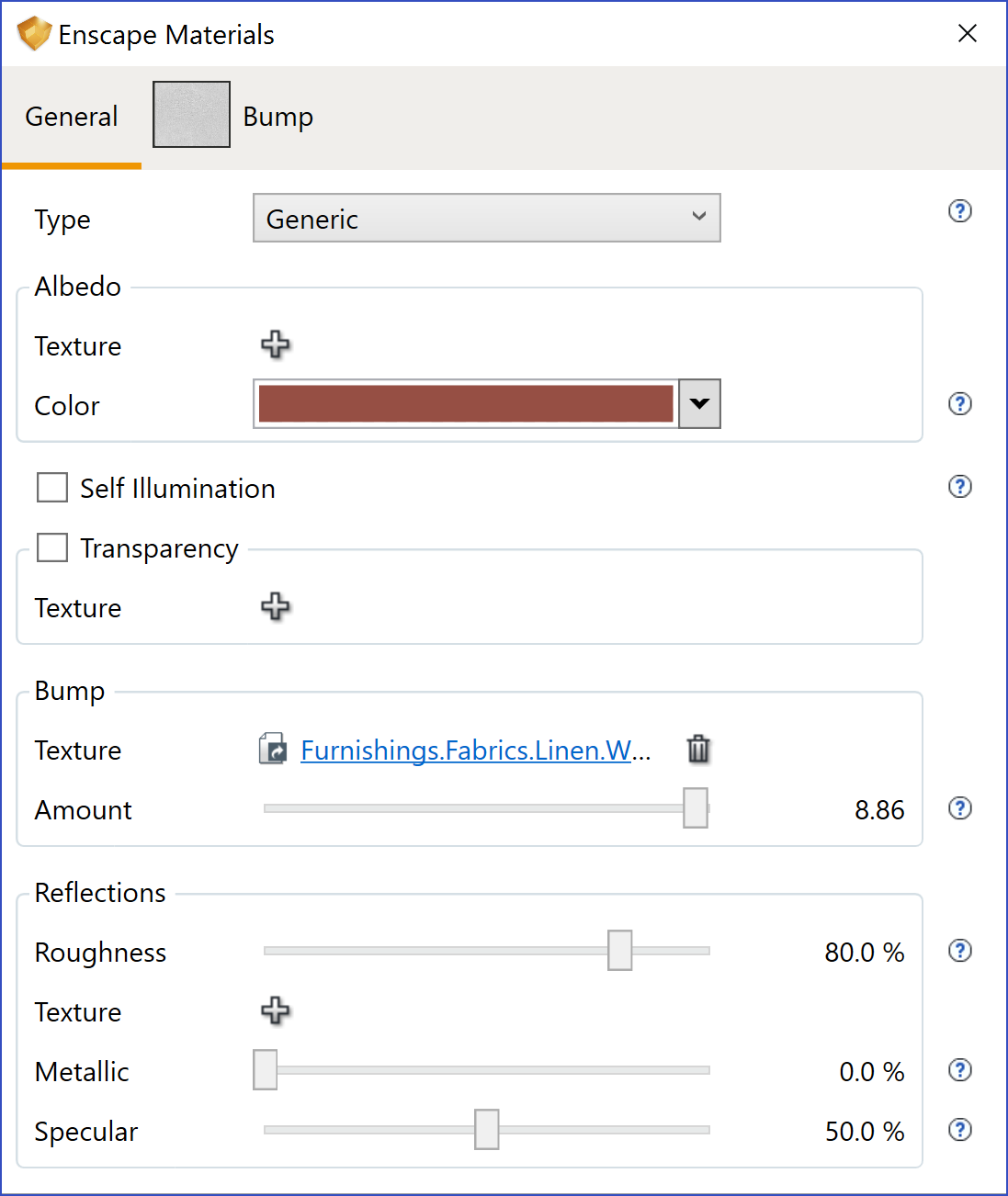
Settings for ottoman fabric
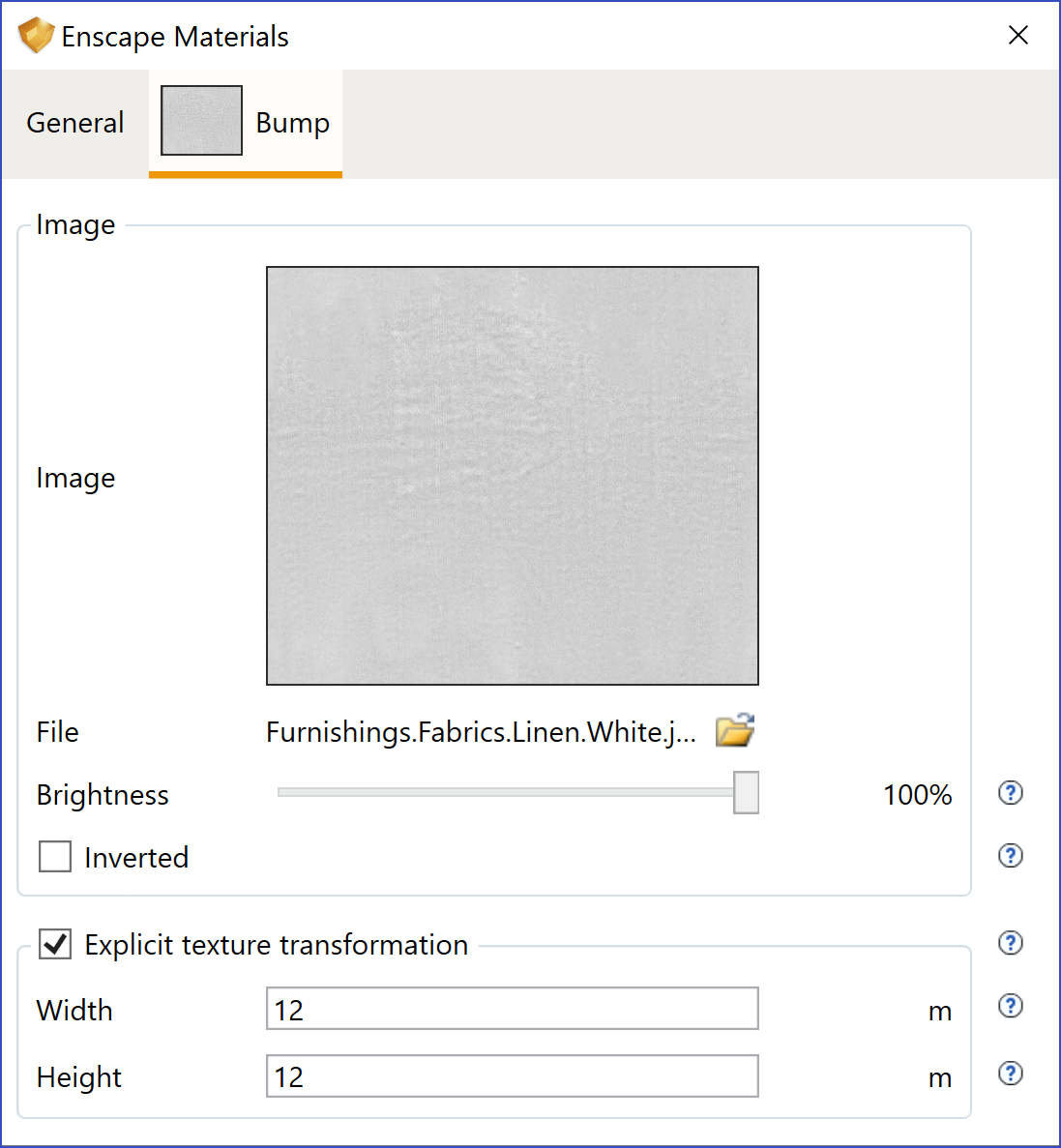
Settings for ottoman fabric
Exploring Foliage
When modeling custom plants, or downloading them from the 3D Warehouse like I did, we can apply the special Foliage material type to the SU material to get more realistic results in Enscape. Notice, in the image below, the selected SU material and then the Type setting in the Enscape Materials dialog.
The Foliage material type also gets a Mask applied. Clicking the Mask tab reveals the settings shown below.
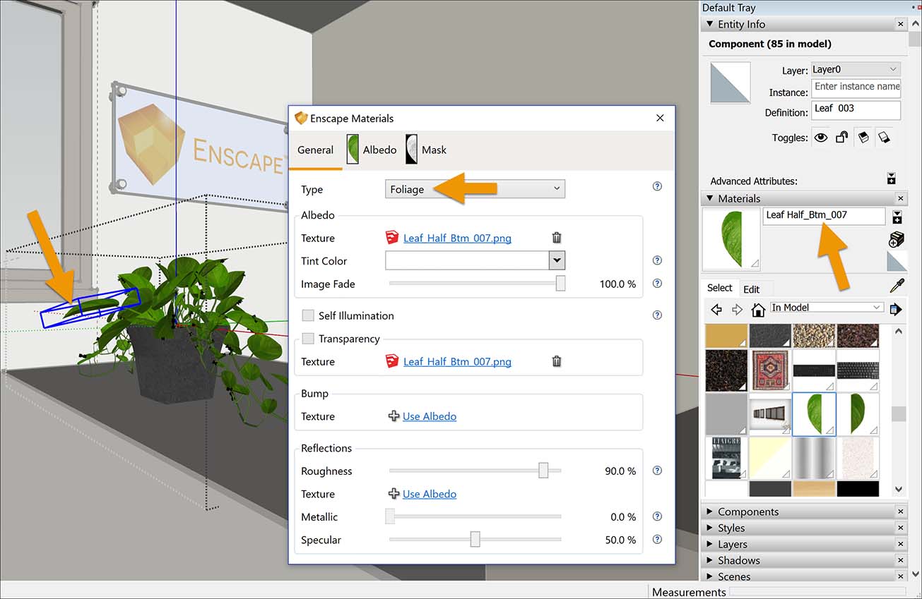
Exploring the Enscape ‘Foliage’ material type
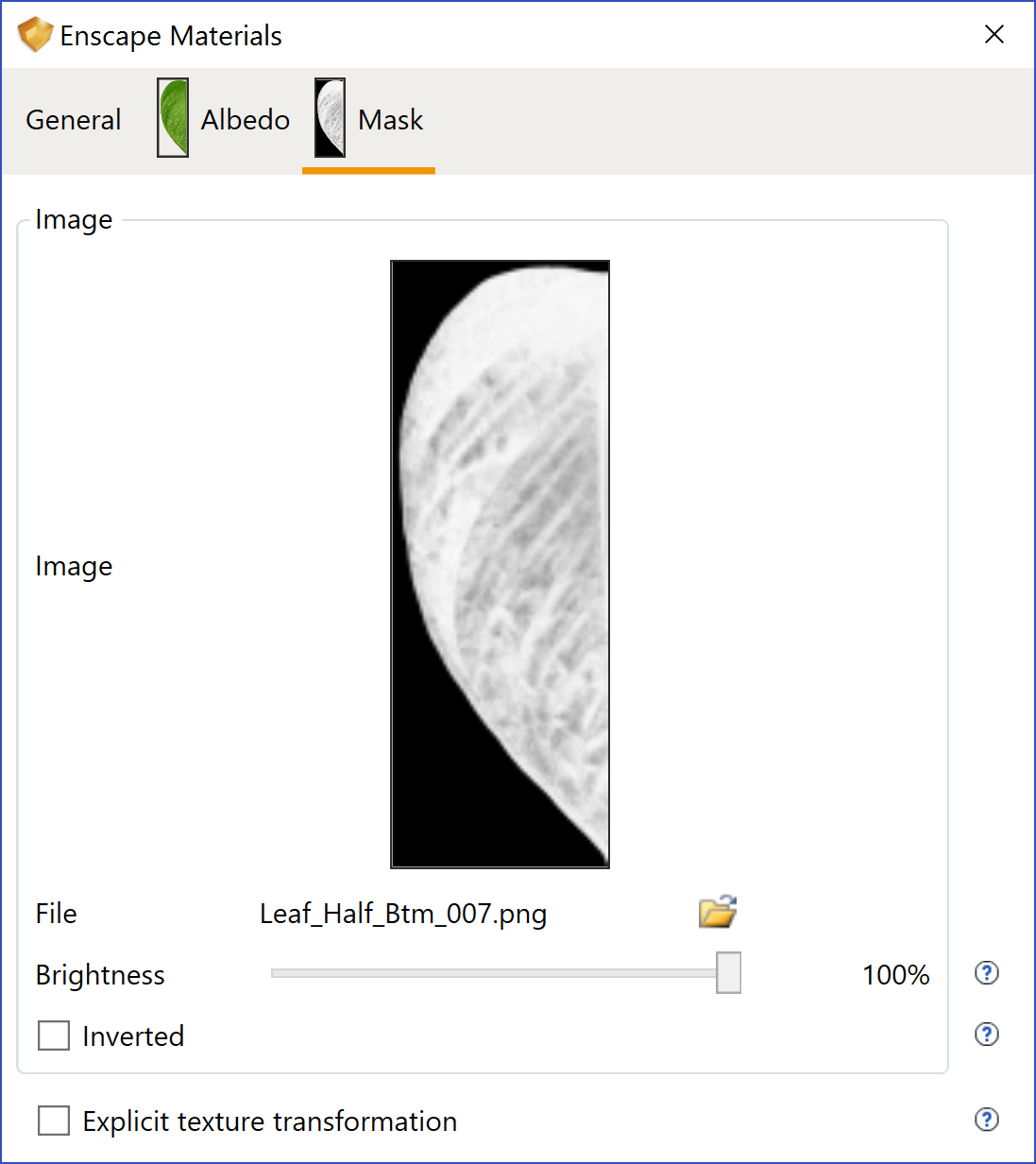
Foliage ‘Mask’ settings
The results are as seen in the next image. You can almost feel the photosynthesis happing! Notice the sense of light passing through each leaf.

Foliage material results in lightly translucent leaves
Exploring Brick and Wallcoverings
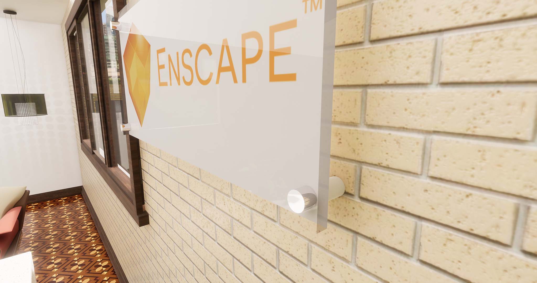
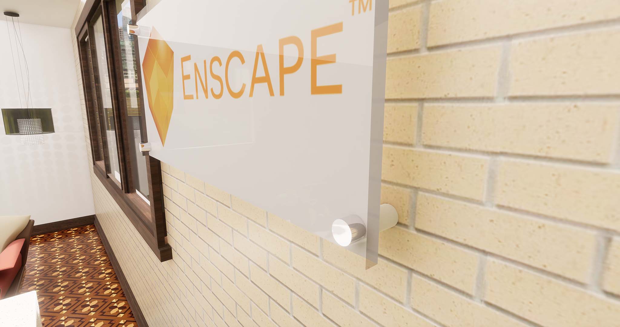
Next, we will take a quick look at a masonry example. Be sure to compare the workflow and results with the similar previous post, but using Revit. The next image starts with the final results. Notice the texture of the brick material as well as the 3D – feel applied to the wall covering.
Just like the disclaimer on a cereal box; “the image has been enlarged to show texture”. Except, in this case, it is not a disclaimer, it is a proclamation! It looks really nice.
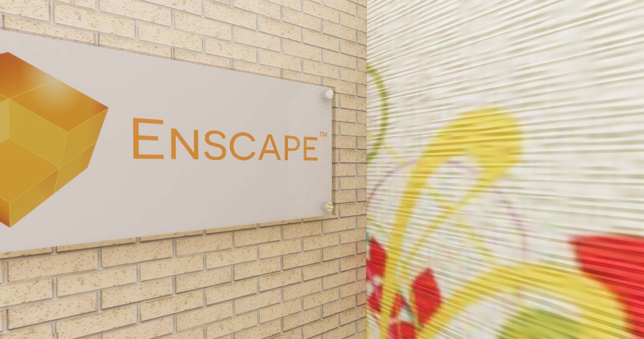
Exploring more materials; brick and 3D – wall coverings
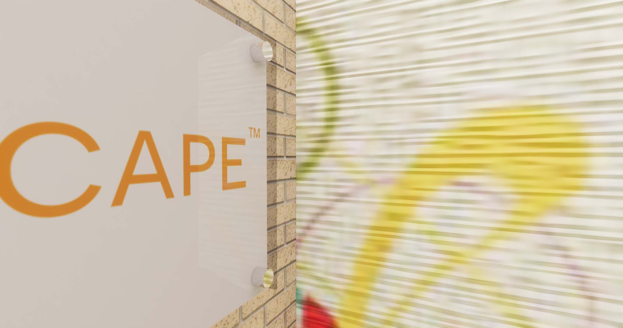
Exploring more materials; brick and 3D – wall coverings
We previously have seen the bump can be tied to the Albedo. In this case, I have selected a separate image file to get more pronounced results from the bump. However, using the Albedo for the bump would have still worked well in this case.
Again, we have an option to Invert the bump. My Albedo and Bump are the same sizes so I do not have to adjust the transformation settings.
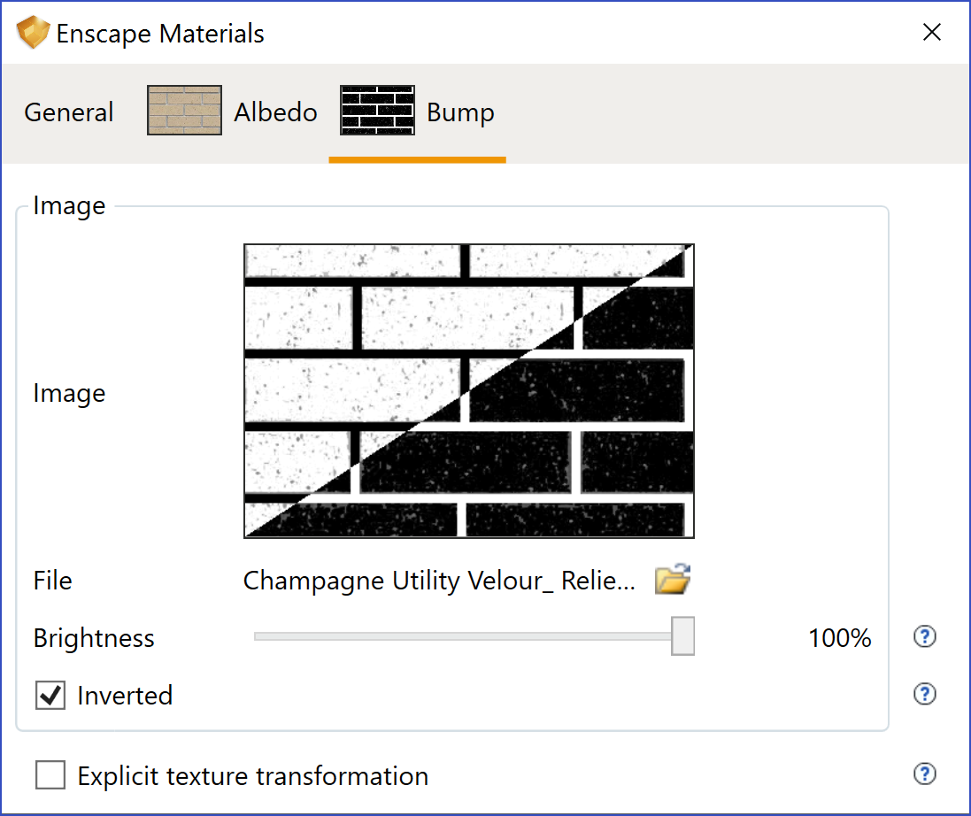
Brick bump settings
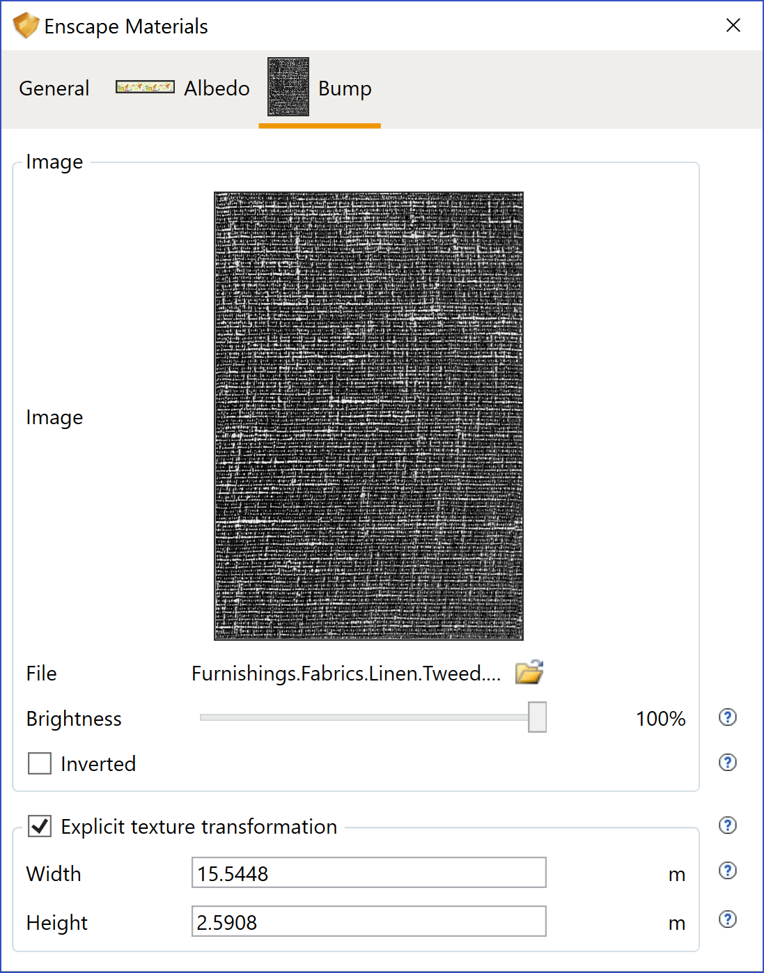
3D – wall covering material settings; bump settings
To achieve the dramatic 3D-texture, I adjusted the Bump ‘Amount’ and the transformation disproportionately as seen in the second image.
The next two images show the brick from another angle and with the bump ‘Amount’ adjusted.
Exploring Brick material bump adjustments
Exploring Brick material bump adjustments
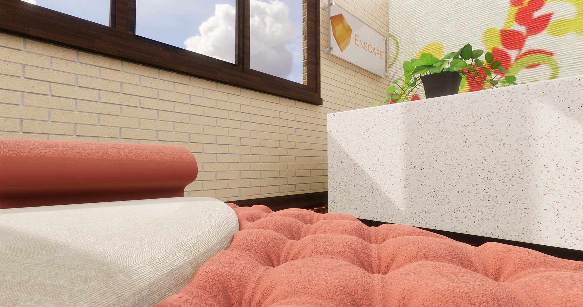
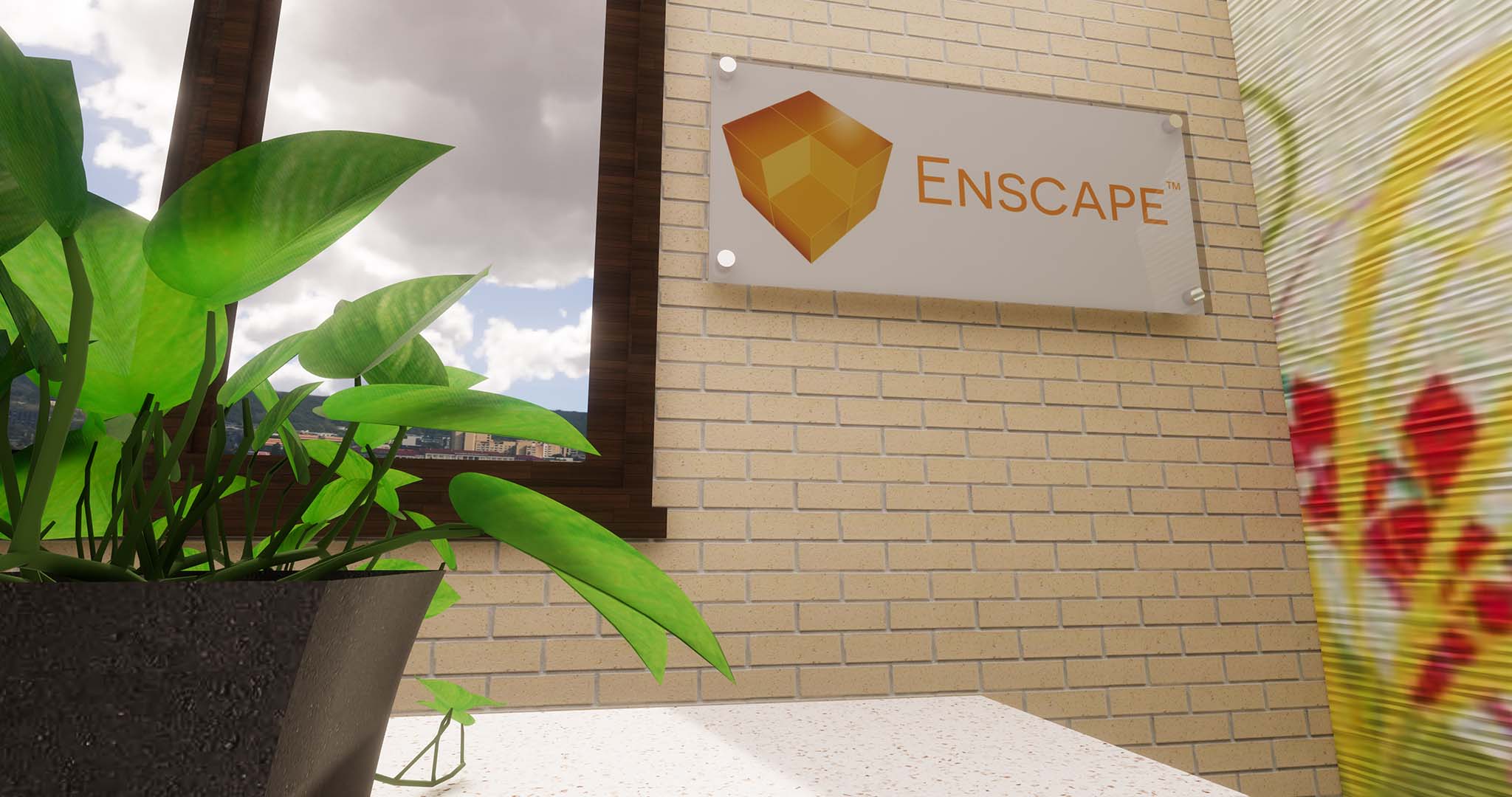
These last two images highlight several materials into a single scene. And while some of these details may not be apparent from a distance, when a portion does fall within close-up view, or you are using VR, the results will certainly be perceivable! It is worth it.
Results; enjoying the fruits of our labor
Conclusion
If you have a certain palette of materials you use often, consider creating them in a SketchUp template file and applying the Enscape enhancements there. Then, every new project will have these advanced materials set up and ready to use!
The images in this post speak for themselves just like the previous SketchUp post. If you use SketchUp and would like to quickly take your design visualization to the next level in terms of graphics realism, then Enscape is the tool for you!

Dan Stine
He is an Author, Blogger, Educator,
BIM Administrator and Wisconsin registered architect.
He works full-time at LHB – a 250 person full-service design firm.
He is an Author, Blogger, Educator,
BIM Administrator and Wisconsin registered architect.
He works full-time at LHB – a 250 person full-service design firm.
LinkedIn – https://www.linkedin.com/in/danstinemn