Best Practices for Lighting and Exposure
When a Revit model has materials set up correctly and properly placed lighting fixtures, it will look great in Enscape without changing any of the default settings . For example, the image below was saved using the default settings. Simply starting Enscape in Autodesk Revit can produce beautiful graphics like this without any user input.

Revit model with default Enscape settings with daylight
Early Design Conditions
This is great, but what about models in the schematic design phase that do not have materials fully developed yet or lighting fixtures placed? Or what if I want to explore the plenum space, for a project in the construction document phase, to look for structural or MEP issues? You may find that the space is too dark. This post will address these questions.
To better understand the issue, we will look at a space with no windows or lighting fixtures. As shown in the next image, this example will also use the default generic wall, one of the walls found in the templates provided with Revit, around the perimeter of the room. Enscape usually does a good job illuminating a scene even when it does not have lighting fixtures or materials applied; it works similar to the auto exposure on a camera. However, when we open our test model in Enscape it looks like this:
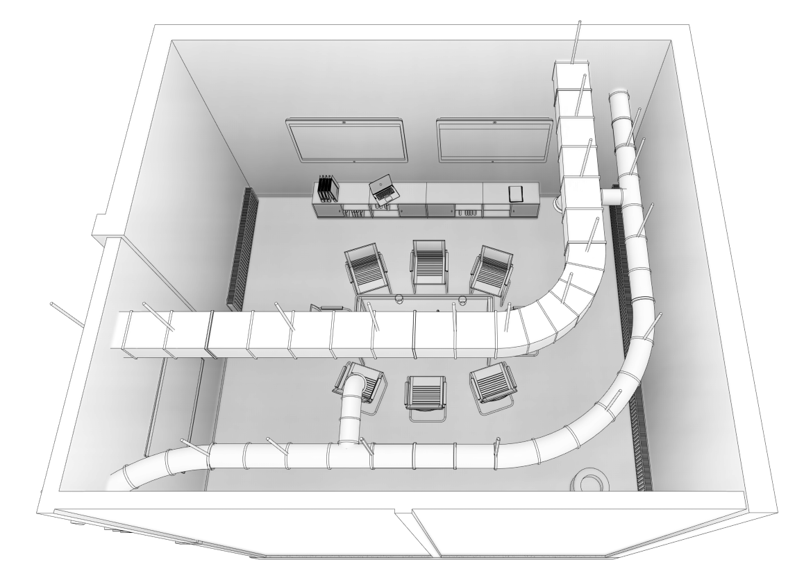
Revit view of subject model
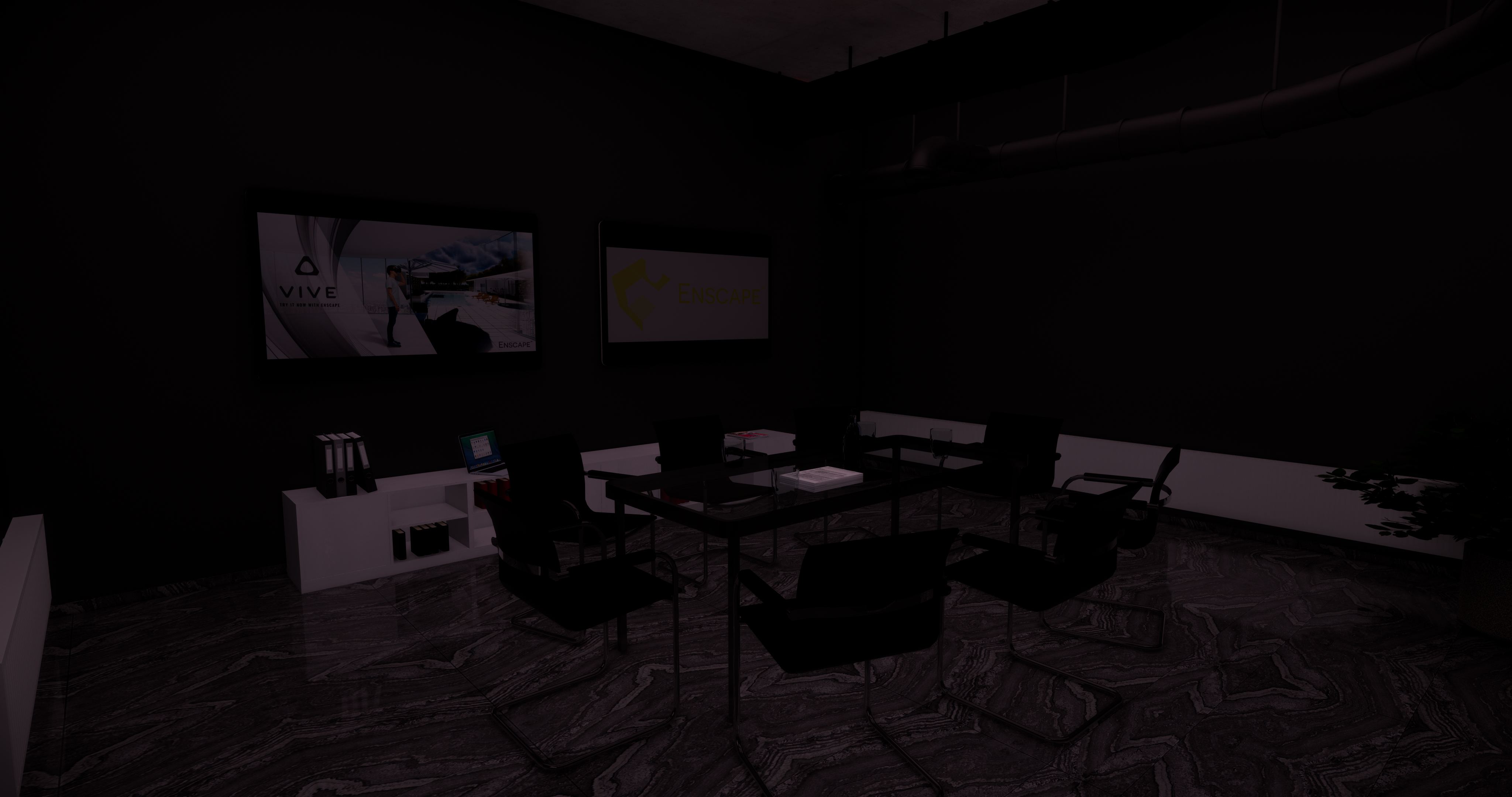
Example of dark image
Revit Material Settings
This image is way too dark by default. Let’s take a look at why the walls are so dark. The generic wall’s material is set to By Category, which means it uses the material assigned in the Object Types dialog (if one has been assigned).
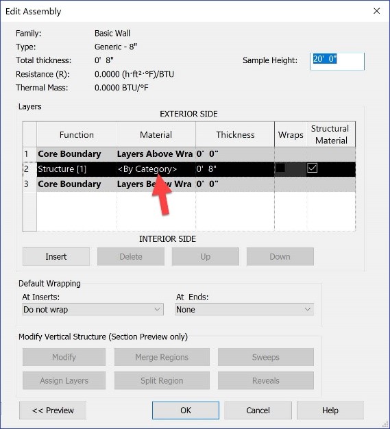
Default wall material settings
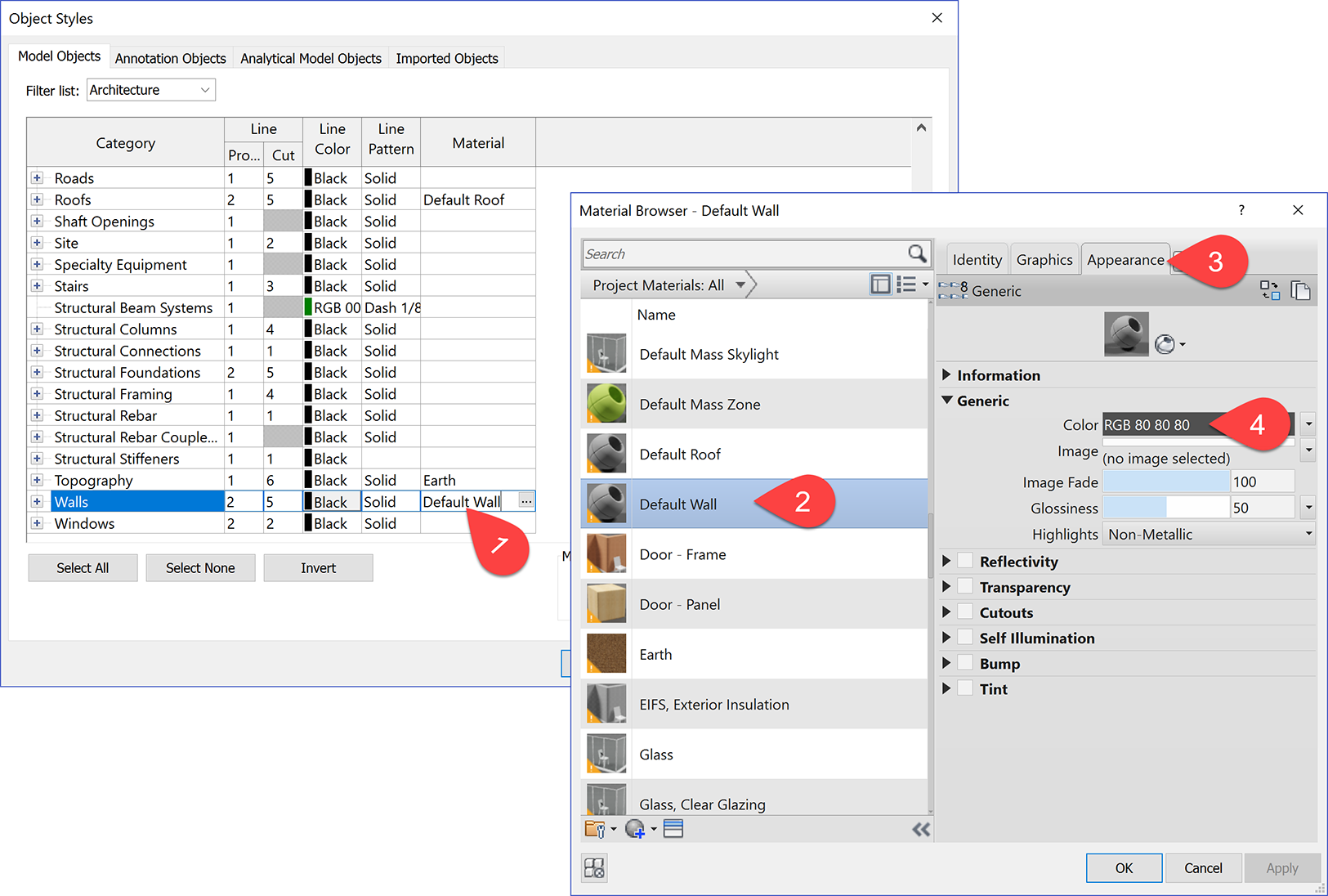
Object Style settings
Looking at Object Types, the ‘Default Wall’ material is assigned to the wall Category. Interrogating that material, we see the Appearance asset, which is what Enscape uses by default in a Revit Material, is set to a rather dark color.
Just like in the real world, and in lighting analysis applications, lighter colors reflect more light than darker colors. Thus, when Enscape is applying ambient lighting and calculating exposure, the result is the dark image above.
What happens if we delete the material assigned to the wall category in Object Types? In this case, there would be no material associated with the walls under consideration. What does Enscape do when no material exists? Does it apply the less-than-awesome grey tone we often see in Revit itself? When a surface does not have a material, Enscape applies a white tone as shown in the image below.

Only the wall material was changed in this image
It is not uncommon for a family to not have a material associated with it, as materials can be freely deleted in a Revit project; you can even delete the last material with no warnings. Enscape deals with Loadable Families the same way, applying an aesthetically pleasing white tone.
Ok, that makes sense. But what if my design or client dictates the walls are a darker color? There are a couple of ways to deal with this. As mentioned at the beginning of this post, proper materials and lights almost always result in a nice image. So, just to make this point again, here is what the space would look like by just adding lights and not changing any Enscape settings or adjusting the wall material:

Only lighting fixtures added to the scene
Enscape Settings
If you are not ready to place light fixtures, or your MEP consultant has not added them to their model yet, you can still quickly get a decent looking image from Enscape. If we open the Enscape Settings dialog from within Revit, we can use the Rendering Quality setting to adjust overall image quality as seen here:

Adjusting rendering quality
Enscape settings in the previous image:
1. Rendering Setting: Draft
2. Rendering Setting: Medium
3. Rendering Setting: High
For some users, realistic lighting and high quality graphics are secondary. If you don’t want to spend time on lighting your scene at this point, consider setting the rendering quality to “Draft” mode for an evenly lit display of your project.
The Ambient Brightness slider in the Image tab of the Enscape settings can be used to brighten a scene. Not only that, but the occluded regions remain darker to emphasize the geometry and depth. This cannot be done in Photoshop! Making changes in the settings dialog results in an instant update in Enscape. Here is what Ambient Brightness and Auto Contrast looks like. The image gets a little better if we check Auto Contrast as seen in the left side of the composite image. Notice how this change enhanced the quality of the flooring as well.

Adjusting contrast and ambient brightness
Enscape settings in the previous image:
4. Ambient Brightness 100% plus Auto Contrast
5. Ambient Brightness 100%
6. Ambient Brightness 75%
Another option, without changing Ambient Brightness, is to manually adjust the Exposure Brightness setting as shown here:
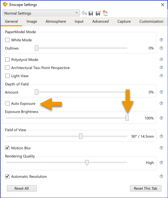
Adjusting auto exposure
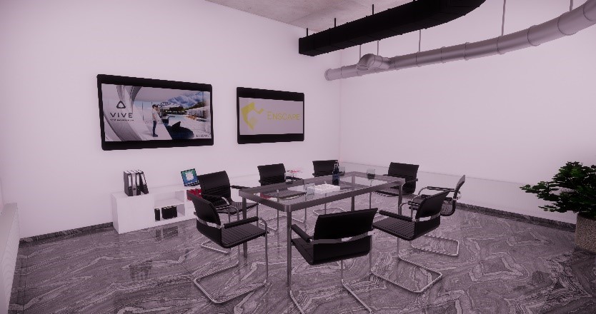
Auto exposure result
Here is a video highlighting the steps used to improve ambient lighting of the interior scene:
The next two images show the same space which has been further developed; windows and lighting fixtures have been added. The first image has the darker walls and the second has a lighter option.
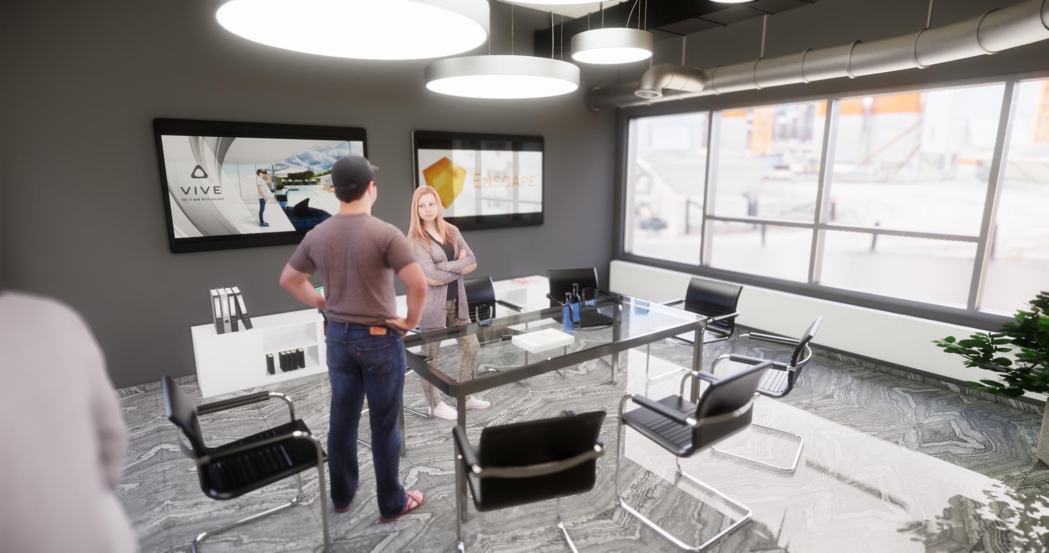
Final image with lights and windows with darker wall finish
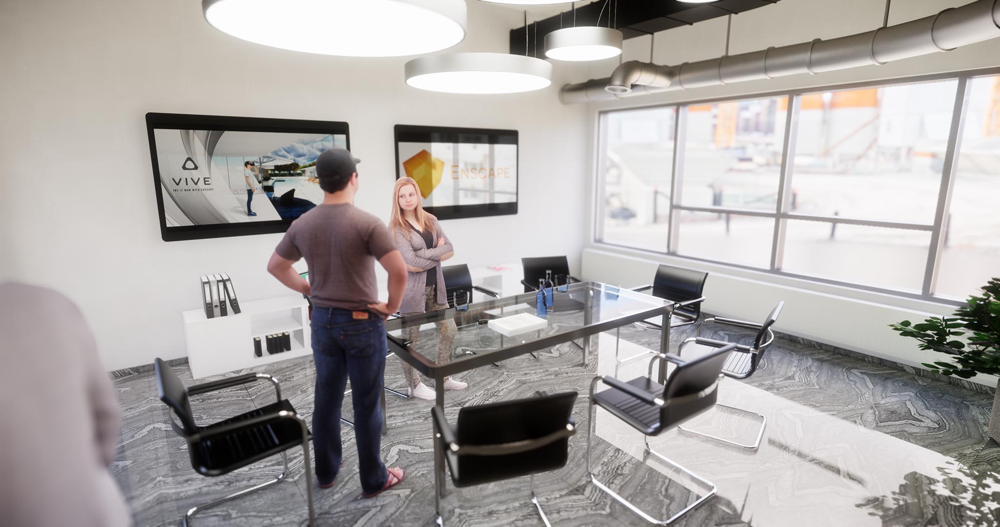
Final image with lights and windows with white wall finish
Plenum and Shaft Spaces
Another similar issue is exploring Plenum spaces in Enscape. When you are in a watertight ceiling space with various structural and MEP materials, the settings described above can help. We will look at one example and introduce a time saving option.
In the next image below, with the Enscape settings completely reset, this is what we see in a plenum space filled with pipes, ducts and structural elements. Way too dark!

Initial view of enclosed plenum space
Simply adjusting the Auto Exposure makes the image look pretty good.

Exposure brightness modified in plenum space
Now, if we go back into the occupiable parts of the building, the image will be way too bright. We would have to turn Auto Exposure back on.

Scene overexposed due to previous plenum space settings
Enscape Saved Settings
Using Enscape’s saved settings option (see image below) will streamline the effort to switch back and forth when needed.

Conclusion
Spaces lit with natural daylight, electric lighting and/or employing lighter color materials will automatically look good in Enscape. When these elements are lacking, Enscape has settings we can use to quickly compensate and still achieve quality images that will convey our design intent faster than any other product on the market today.
Consider using these techniques to present your design live in front of your client using Enscape. They will be impressed by the quality of the real-time rendering experience, as well as empowered to explore portions of the project which are important in that moment. If you have not yet given Enscape a try, download the trial today and bring your Revit, SketchUp, Rhino or ArchiCAD model to life. Things will never be the same again!


Dan Stine
He is an Author, Blogger, Educator,
BIM Administrator and Wisconsin registered architect.
He works full-time at LHB – a 250 person full-service design firm.
He is an Author, Blogger, Educator,
BIM Administrator and Wisconsin registered architect.
He works full-time at LHB – a 250 person full-service design firm.
LinkedIn – https://www.linkedin.com/in/danstinemn